This is the 35th installment of my monthly feature on Typewolf where I share my favorite type-driven websites from the previous month and then write a little about the typographic details behind the designs. You can check out last month’s post for November here.
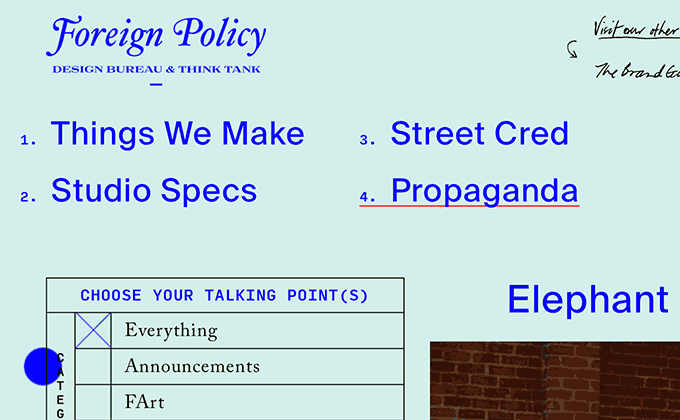
Foreign Policy
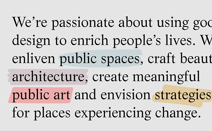
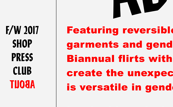
The type on the Foreign Policy site is a disparate mishmash of different aesthetics—Caslon is classy and dignified, Suisse Int’l is clean and modern, while Input Mono is contemporary and techy. There is also handwritten scribbled text scattered throughout the design. On most sites this would be too much randomness to take in, however, in this case, I think it perfectly complements the studio’s colorful design work, which is equally all over the place, never sticking to a single style.
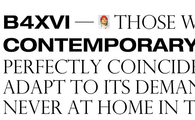
CIRQ
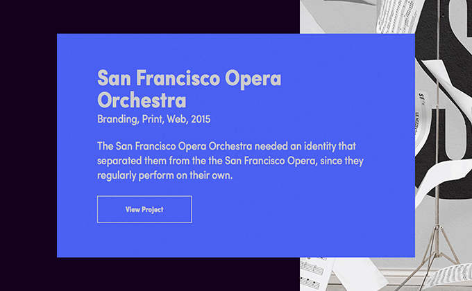
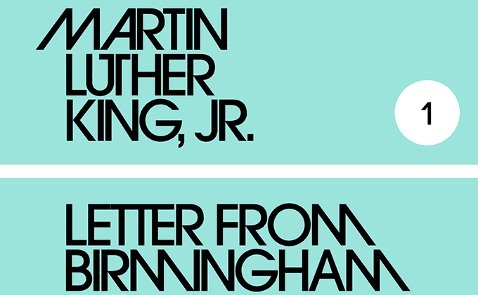
Champion Gothic is a sans-serif from Hoefler & Co. that was inspired by late nineteenth-century woodtype. This style of woodtype predates the idea of a cohesive type family—instead, each different weight and width would feel more like a unique, one-off design. Therefore, each width of Champion Gothic feels like the “normal” width, rather than a condensed or extended variation. The CIRQ site takes this concept and mixes the various widths of Champion Gothic mid-word, which creates a unique, jarring effect that grabs the reader’s attention. Egyptienne, a slab serif from Adrian Frutiger, is combined with Champion Gothic and used in a more straightforward manner, balancing out the quirky, irregular-shaped display type.
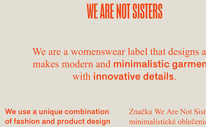
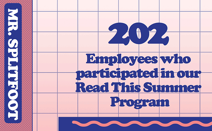
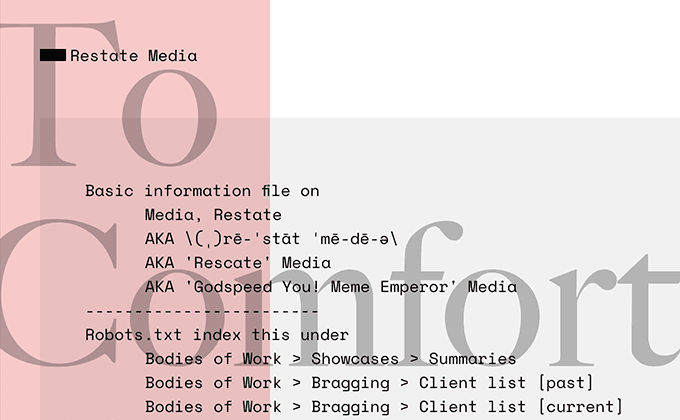
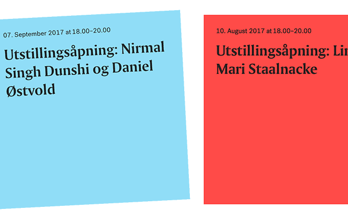
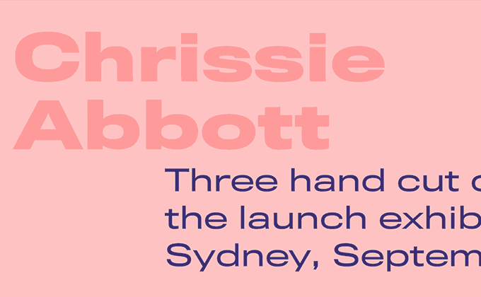
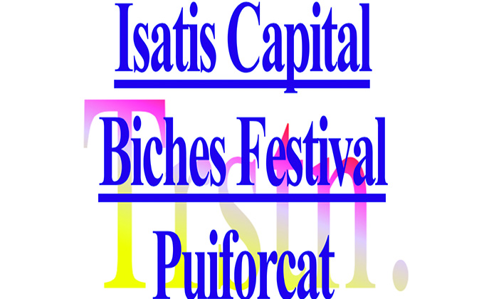
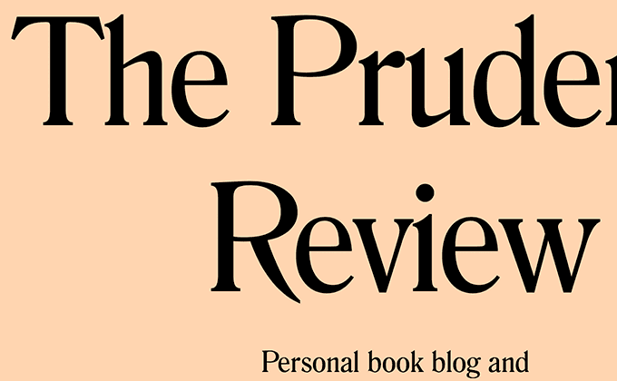
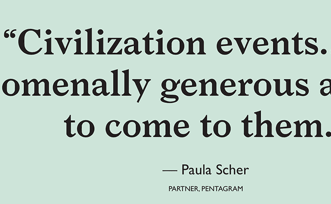
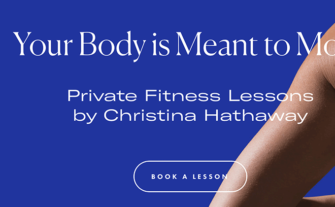
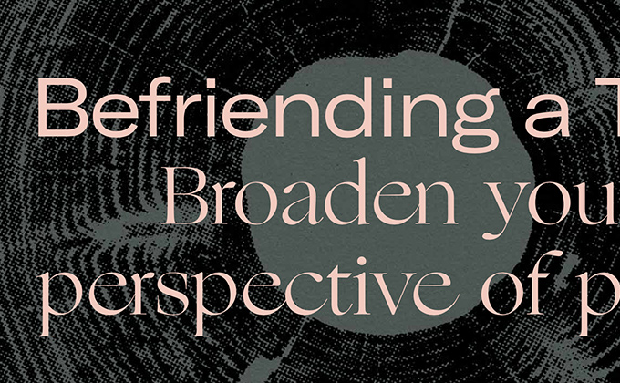
We Are Not Sisters
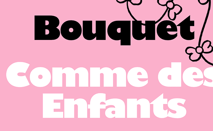
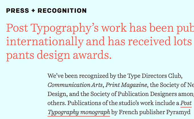
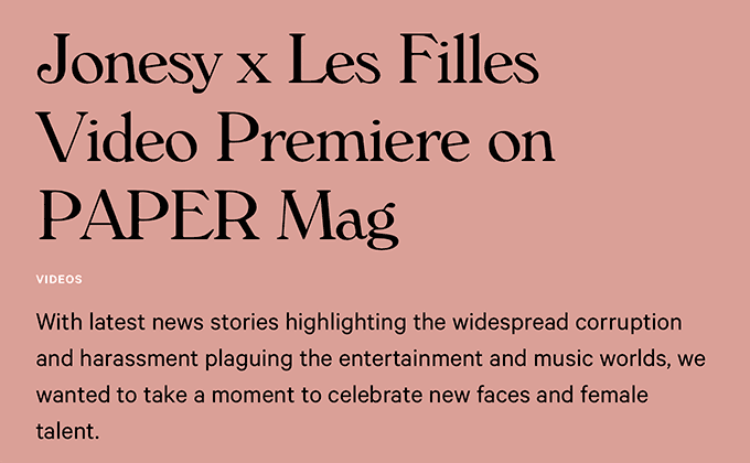
Maria is a mysterious sans-serif that is hard to dig up much information on. It looks a lot like Helvetica or Akzidenz Grotesk, but the uppercase design takes on a more geometric appearance. It’s combined here with Times New Roman—the brutalist font of choice—and often mixed with it in mid-sentence. The bright red text seems like it should be harsh on the eyes, but it’s actually quite readable on the warm, beige background.
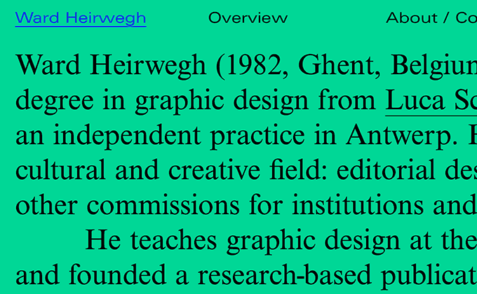
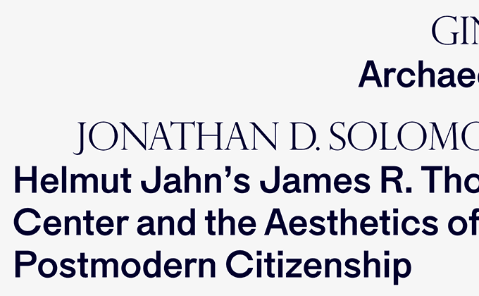
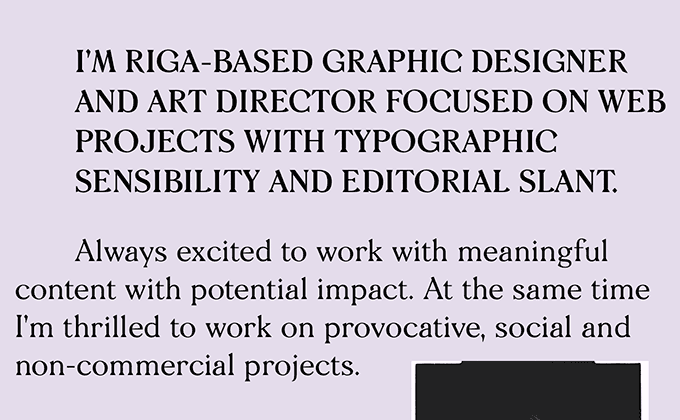
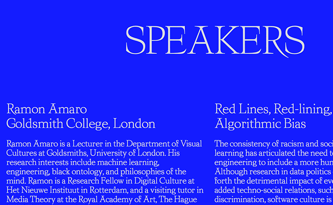
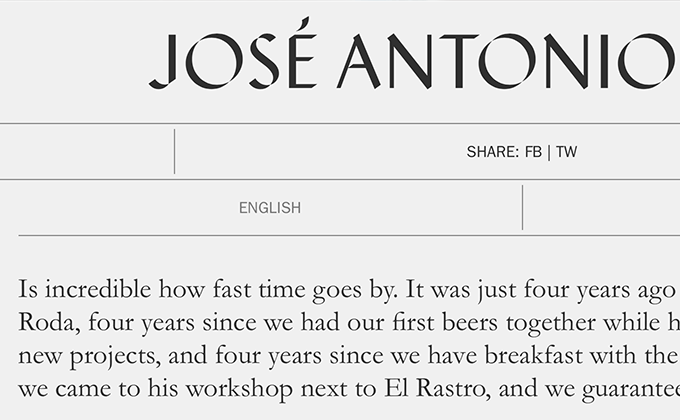
Ward Heirwegh
This is another site this month that could possibly be described as brutalist. But this time it’s not using the brutalist-approved Times New Roman; instead, it features Nimbus Roman, a Times look-alike. As with the previous site, this design uses colors that could be described as “harsh” (the blue on green, specifically), but the text is still perfectly readable. Bold colors like these immediately create memorable brands, whether you want to call it brutalist or otherwise. An extended width of Univers is used for the navigation and prevents the serif from completely dominating the design.
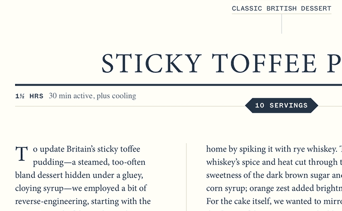
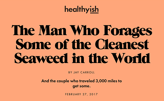
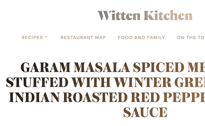
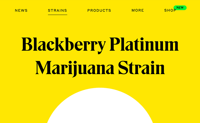
Milk Street
I wouldn’t describe this design as brutalist or ultra-hip like the above sites—it just features solid typography that is beautifully executed (although the drop cap in the screenshot above looks a little undersized). The monospaced version of Klim’s Founders Grotesk and a condensed cut of DIN are set entirely in uppercase throughout, while the serif Minion is used for headlines and body text. Minion always works well as a classic serif choice—it has the Old Style appearance of Garamond but with more contemporary features such as a larger x-height and more open apertures. Freight Sans is used on the button labels, which may be an unnecessary additional typeface, as there are already three other typefaces used. But overall, this type looks gorgeous and refined and perfect for the Milk Street brand.
- Where to get Founders Grotesk Mono →
- Where to get DIN →
- Where to get Minion →
- Where to get Freight Sans →
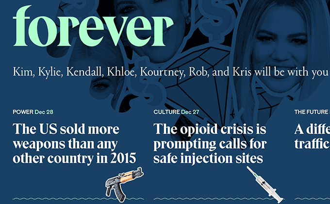
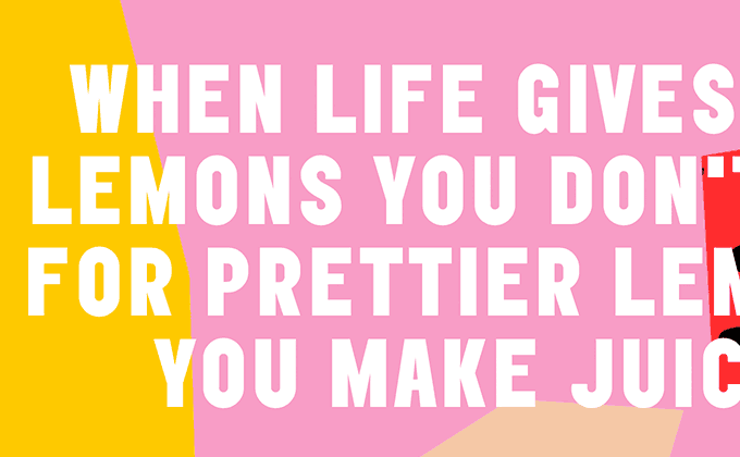
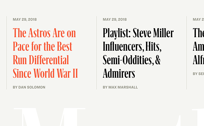
The Outline
The Outline is one of my favorite sites to come along in awhile from a typographic perspective. The type looks more like a designer’s portfolio site than a typical online publication (although seeing the Cadillac advertisements everywhere keeps throwing me off—is this really their target audience?). There are four different typefaces used and each one is used purposefully. The evil-looking serif Eksell Display and the quirky sans-serif Maria serve as the main branding typefaces. Both typefaces are memorable but neither work well at small sizes—Eksell Display has too much stroke contrast while the apertures on Maria are way too tight. Portrait is introduced as a companion serif to Eksell and features similar sharp, triangular serifs but with way less stroke contrast. Likewise, Fakt is used as a companion sans to Maria and works better for body text with its more open apertures. Using four typefaces allows the best of both worlds—distinctive display type while still having text that functions adequately in non-display settings.
Stay Tuned for Next Month’s Post
I’ll be publishing a new type-driven design roundup post like this at the beginning of every month. Enter your email below if you want to be notified when it is published.