This is the 55th installment of my monthly feature on Typewolf where I share my favorite type-driven websites from the previous month and then write a little about the typographic details behind the designs. You can check out last month’s post for July here.
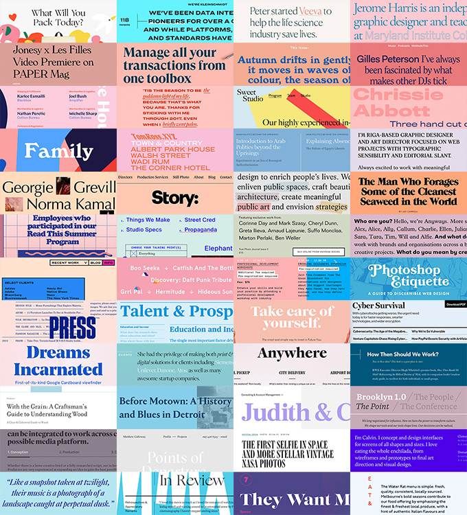
Kleinschmidt
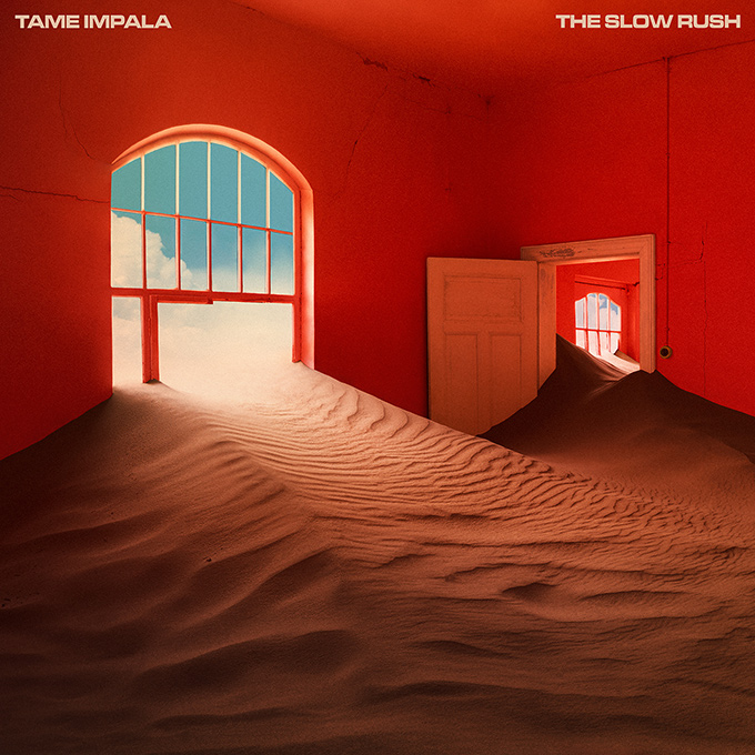
Extended sans-serifs have been all the rage lately, especially set in all caps like seen here. It’s refreshing to see Hoefler & Co’s Ringside family used, as opposed to GT America or Druk which seem to be dominating the extended sans market. The entire site is set in Ringside with no other typefaces used. Ringside is a huge family available in a wide range of weights and widths, so it’s well suited to take on such a task.
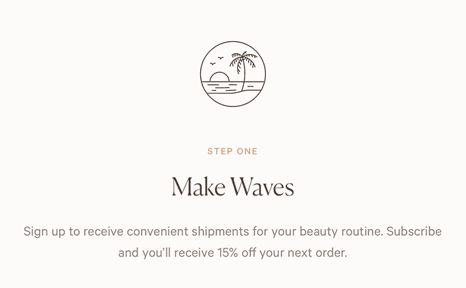
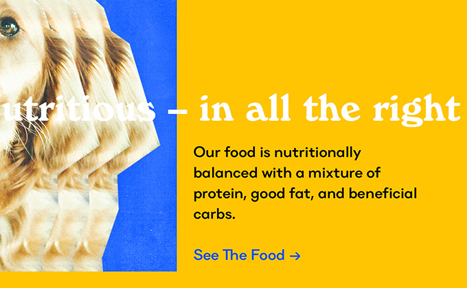
Playa
Canela continues to be massively popular in the fashion and beauty products space as evidenced here. The slight tapering on the stroke endings give it a refined, elegant quality that exudes style. It’s paired here with Klim’s geometric sans Calibre which adds a contemporary feel to the design. It’s always nice to see sites like this where the typography matches up perfectly with the product packaging. I’m always surprised at the number of products I see with beautiful type, only to be disappointed when I visit the website to find that it’s set entirely in Open Sans.
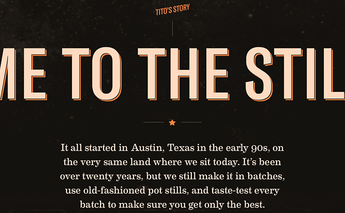
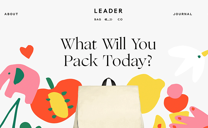
Tito’s Handmade Vodka
I think this is one of the few times I’ve seen a compressed style of GT America used as opposed to the extended style which seems to be everywhere these days. A layered effect is added to the headline type using the CSS text-shadow property, making the text pop out from the background. The smaller headlines and body text are set in Eames Century Modern, which feels like a more modern and refined version of Clarendon. The playful brush script Suti rounds out the design set entirely in uppercase.
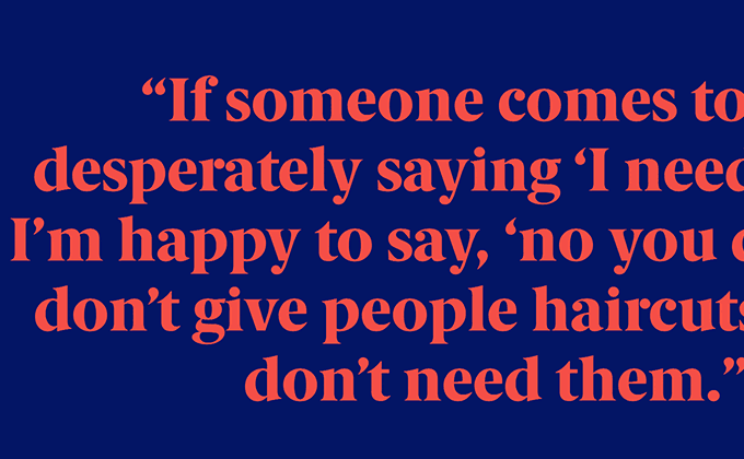
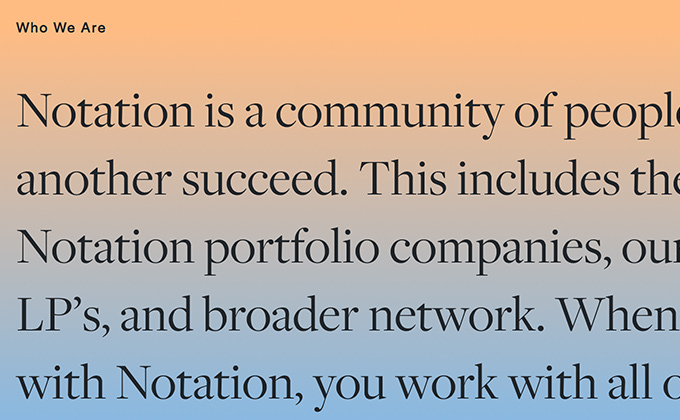
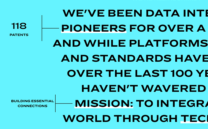
Heard at Work
Berlingske Serif is one of my favorite typefaces, but it seems to be overshadowed by other more popular serifs such as Tiempos (which seems especially overused for this particular style of design). I love typefaces like these that have small details that are unique but don’t immediately jump out at you—the arm on the lowercase r is actually a detached floating circle, but it doesn’t seem to negatively affect the readability of the typeface. Berlingske Serif is paired here with Work Sans, a free font available on Google Fonts. The site uses proper apostrophes and quotation marks, which is pretty important for a site comprised entirely of quotes from co-workers.
Stay Tuned for Next Month’s Post
I’ll be publishing a new type-driven design roundup post like this at the beginning of every month. Join my monthly email update list if you’d like to be notified when it is published.
Learn How to Get Truly Gorgeous Typography
I’ve distilled everything I’ve learned from writing these articles over the last five years into a single, definitive resource—the Flawless Typography Checklist. Read it straight through as a complete master course and then continue to use the checklist as a tool on every design project to ensure your type will always be flawless.