This is the 17th installment of my monthly feature on Typewolf where I share my favorite type-driven websites from the previous month and then write a little about the typographic details behind the designs. You can check out last month’s post for May here.
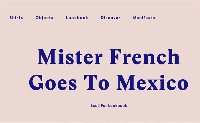
Mister French
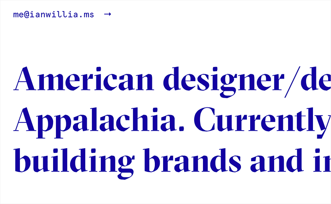
The type on this site is spaced rather loosely with added letterspacing — I think this touch helps give off an easy-breezy feel that matches the laidback aesthetic of the Mister French brand. Apercu and the heavy, poster style of Stanley make for a unique pairing, especially when the two typefaces are combined in mid-sentence.
Pannier
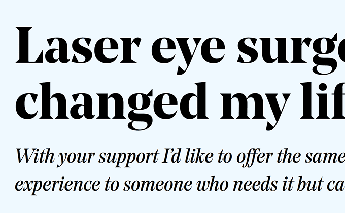
The Old Style serif typeface Minister makes for a wonderful body text face, especially on my new Retina iMac where the fine details of the design really come through. On most of the pages on this site the body text is set center-aligned which looks fine for a single paragraph, however, once the copy expands to several paragraphs it becomes a bit tiresome to read. On a few of the sections that feature longer content, the layout actually changes to a two column, flush left layout which is much, much easier to read. Proxima Nova makes an appearance on the site as well, mostly for headers set in uppercase.
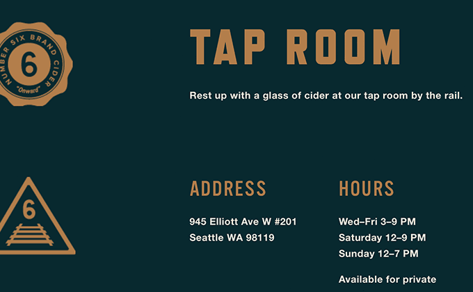
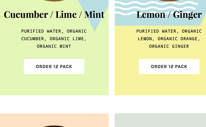
Number 6 Cider
Mark Simonson’s Refrigerator Deluxe does contain a lowercase alphabet but I think I’ve only ever seen it set in uppercase. The same can also be said for Alternate Gothic — condensed typefaces like these almost always work best set in all caps. Helvetica Neue is used for body copy but only the bold weight is used, most likely to help match the heaviness of all the uppercase type.
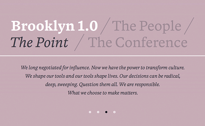
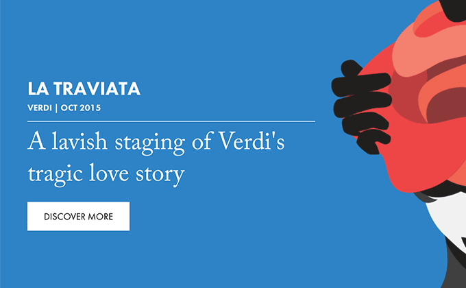
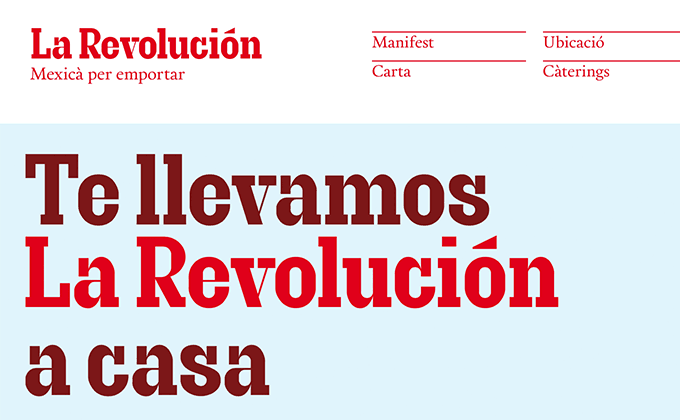
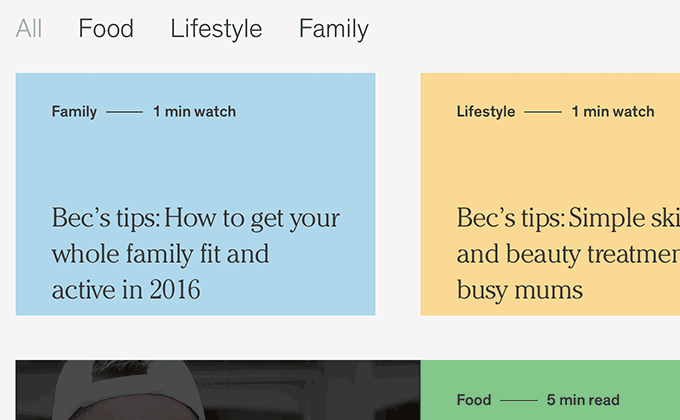
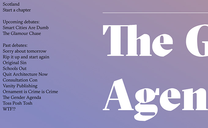
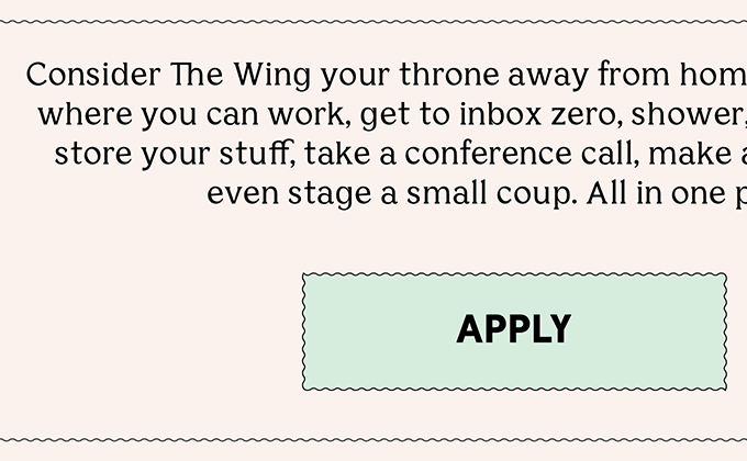
Point Oh!
Blanco is a serif typeface designed by Dave Foster that currently isn’t available to the general public. The designers must have worked directly with the type designer to license a special copy — that is an excellent way to ensure the type on your site is unique and not overused. The text in the footer is set in uppercase Futura.
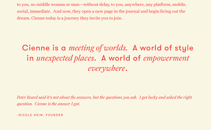
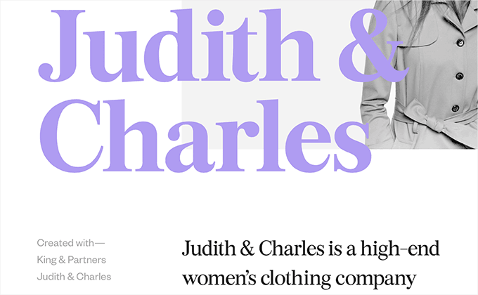
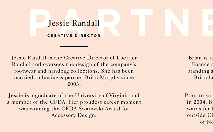
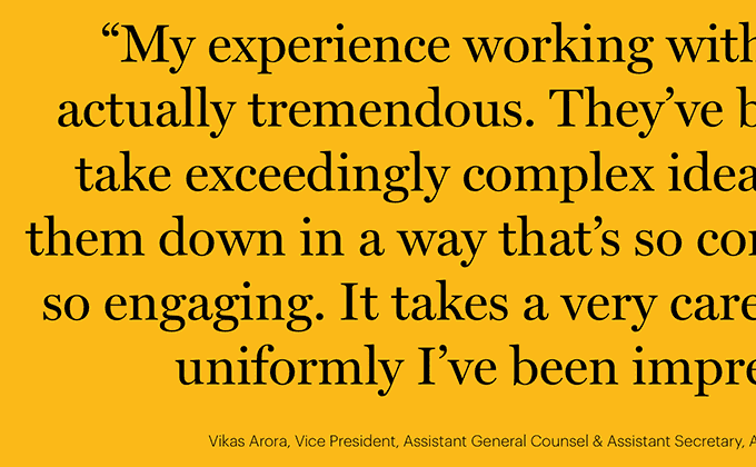
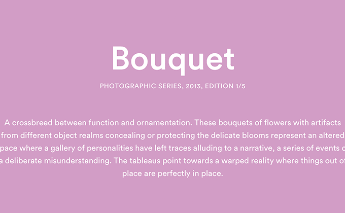
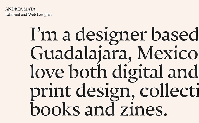
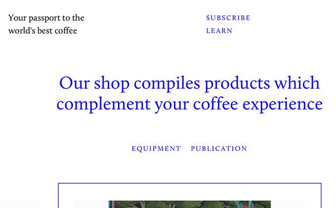
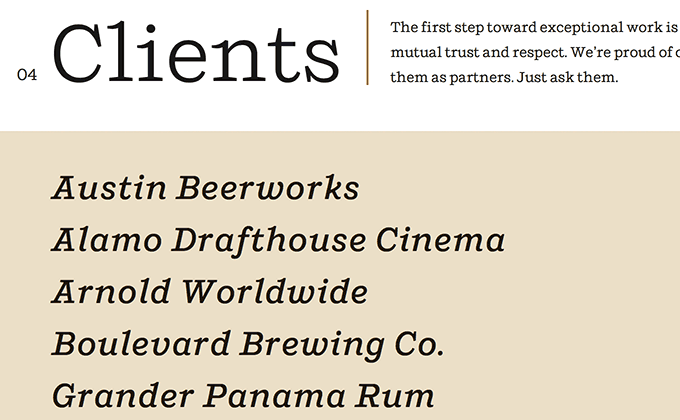
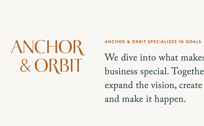
Cienne NY
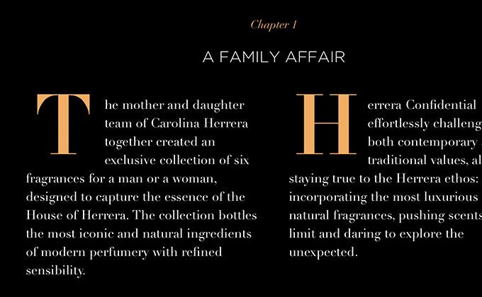
Farnham is a serif typeface from Font Bureau that seems to be used more in print than on the web. The body copy set in Farnham is a little on the small side, however, the adequate line height makes it easy to read. I’ve always thought that smaller body type tends to look a little more refined whereas larger body type can sometimes feel a little horsey. The body copy is also set with proper apostrophes, quotation marks and dashes which definitely helps add to the refined feel. The quirky GT Walsheim makes for a fun pairing with Farnham and DIN is also used sparingly throughout the site. The design probably didn’t need a third typeface but I think they probably integrated DIN into the site to match the Cienne logo, making the design feel more cohesive.
Goodmoods
Choosing two display faces as the only typefaces on your site is usually a pretty dangerous idea. Luckily this site is light on body copy — no more than a single paragraph in most places — so I think it can pull off not having a proper text face. Voyager is a geometric sans-serif with loads of personality and I think it creates an interesting contrast with the delicate, calligraphic Ogg. Neither typeface was created with longform reading in mind, however, they both add plenty of character to the design which I’m sure is the intended goal.
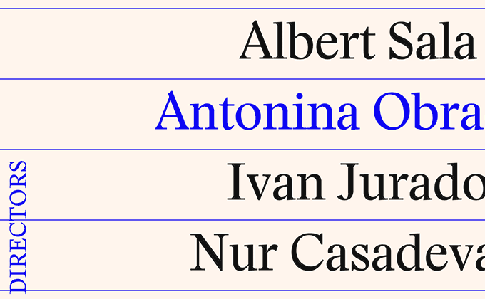
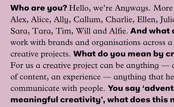
Lesli Ink
This site is interesting in that the about page is essentially a style guide that includes a section on their use of type. The Lesli Ink brand uses three typeface families — Caslon Graphique, Visby CF and Harriet (both the display and text versions). Three may seem like a lot of typefaces but as long as the use is consistent (which it is) I think it allows a little more room to make things dynamic and engaging. Georgia is actually used in places for body copy, most likely as a substitute for Harriet Text to cut back on page weight from loading too many fonts.
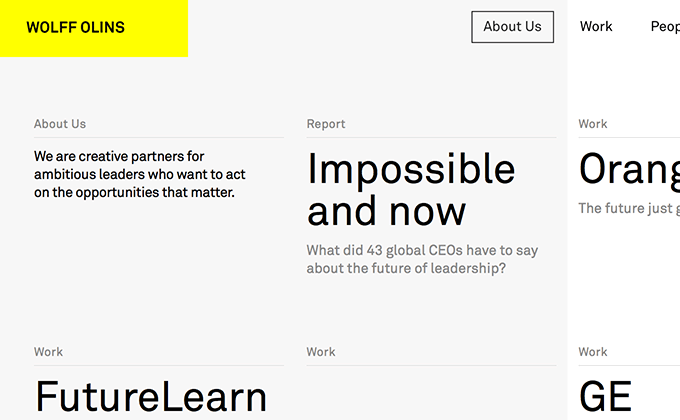
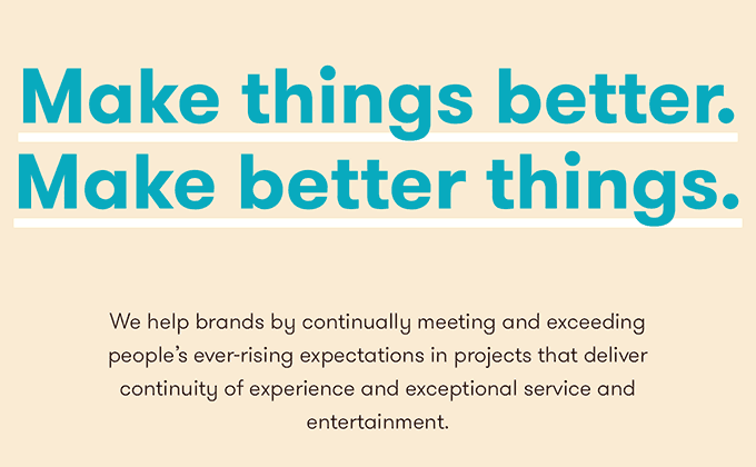
Wolff Olins
In contrast to the previous site above, the Wolff Olins site uses only a single typeface. This adds a slightly more serious, no-nonsense tone to the design. Not to say that the typeface they are using, Akkurat, doesn’t have character because it definitely does. Akkurat takes the neo-grotesque model of Univers and mixes in some characteristics of DIN, creating a new type of grotesque that went on to be a major influence on Apple’s new San Francisco typeface.
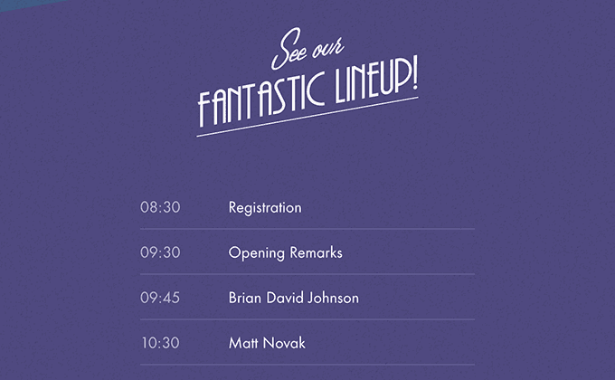
dConstruct 2015
The design for the dConstruct 2015 site features a retro-futuristic concept and the chosen typefaces perfectly fit this aesthetic. The Art Deco inspired sans-serif, Andes, is combined with the 1950s evoking script face, Lamplighter Script. Futura is added to complete the look. The video game Fallout 3 actually shares a pretty similar retro-futuristic type of look using Futura combined with a script face.
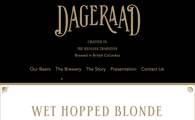
Dageraad Brewing
This is a perfect example of a brand having completely cohesive visuals spanning both print and the web. It helps that the design agency, Fivethousand Fingers, designed both the packaging and the website. I think it’s interesting that both the serif typeface, ITC Stepp, and the sans-serif, Avenir, are modeled after typefaces from a similar time period — ITC Stepp was based off a Stetson Shoe Company logo from 1930 and Avenir was modeled after Futura from 1927. The two typefaces couldn’t feel any more different but they still share a common history.
Stay Tuned for Next Month’s Post
I’ll be publishing a new typography inspiration roundup post like this at the beginning of every month. Enter your email below if you want to be notified when it is published.