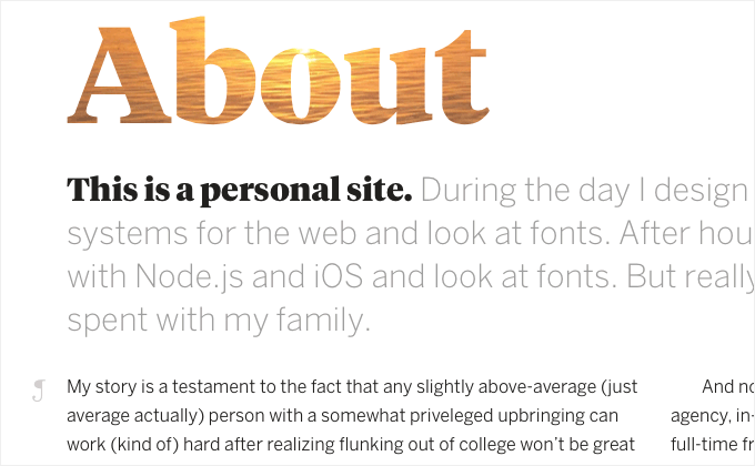
Every day on Typewolf I feature a site with nice typography. Out of the 365 sites featured over the course of 2014, these are my top 40 personal favorites. I was originally planning on doing a top 10 list, but after attempting to narrow down my favorites I realized there were just too many sites with beautiful type for me to choose just 10 or even just 20. So yes, 40 is a lot but I think every single one of these sites has something for type connoisseurs to appreciate.
Ok, get ready to scroll because this is a long post…
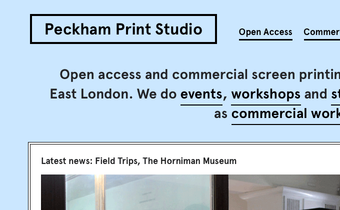
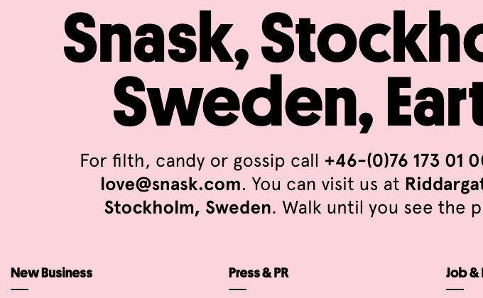
![Snask]()
40) Snask
I remember the previous design of Snask was one of the first places I saw Apercu being used on the web. The folks at Snask are real trendsetters as this typeface has exploded in popularity over the last year or two. Their new redesign sticks with Apercu but adds in Platform, a geometric sans from Commercial Type. The bold weight pairs surprisingly well with Apercu. Lacrima Senza from Milieu Grotesque is used for the nav set in uppercase.
![EBD Journal]()
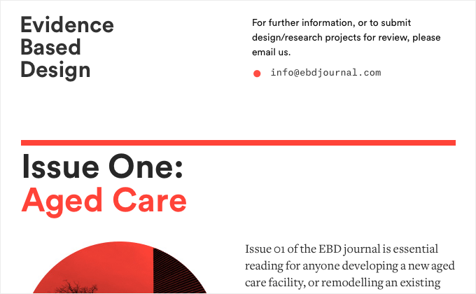
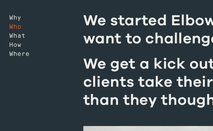
39) EBD Journal
Rather than using a line break between paragraphs, the body copy on EBD Journal (set in Freight Text) follows the classic type setting convention of indenting the first sentence of each paragraph with no extra line break. This is how type has been set for hundreds of years in the print world but this convention was never widely adopted on the web for whatever reason. Circular, a geometric sans-serif from Lineto, is used for headers and titles while the monospaced font Atlas Typewriter is interspersed throughout, used for captions and footnotes.
![Les Deux Mondes]()
38) Les Deux Mondes
Larsseit, one of my personal favorite sans-serifs, seems to be getting more popular as I keep coming across more sites using it. This single-typeface site makes wonderful use of it. The color scheme of the type changes color every time you refresh the page which is a neat touch.
![Mount Vernon]()
37) Mount Vernon
This is a deep site with a ton of content and the designers did an excellent job of keeping the type consistent throughout. Gotham and Mercury, both from Hoefler & Co, make a beautiful combo. Having white text set on top of a photo background like in the header is always a dangerous thing to attempt though — using a light photo can quickly make the type illegible. Right now they seem to do a well enough job of only using dark photos that contrast with the type, however I’d hate to see what happens if the client starts adding their own photos.
![The Outpost]()
36) The Outpost
I’m really impressed by how closely the designers of this site were able to match the typography from the print edition of the magazine. Leitura News and Leitura Display were specifically created with editorial usage in mind and this superfamily looks absolutely beautiful on the web as well as in print.
![Cameron Askin]()
35) Cameron Askin
I love sturdy calligraphic-inspired typefaces like Lapture. I think they work so well just set at a large size against a flat color like on Cameron Askin’s site.
![Homepolish]()
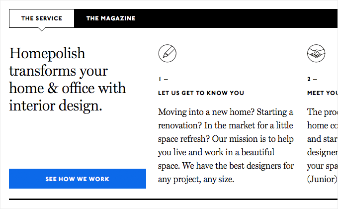
34) Homepolish
I’ve always been a big fan of Miller, a Scotch Roman from Matthew Carter, designer of the ubiquitous Georgia. Pairing Miller with ITC Johnston, a humanist face famous for its use in the London Underground, makes for a unique and interesting combo. My only complaint about this site is the logo which uses a scaled down PNG, making it appear slightly blurry. Setting it as a web font would ensure a clear and crisp display.
![The Many Faces Of... Sigourney Weaver]()
33) The Many Faces Of… Sigourney Weaver
Another popular typeface of the 1970s, ITC Serif Gothic, makes an appearance on Paravel’s Sigourney Weaver tribute site. ITC Serif Gothic was used in the original Star Wars posters, so it definitely has a lot of sci-fi connotations which makes it the perfect typeface choice for this sci-fi focused design. It’s combined with Proxima Nova, which is starting to feel so ubiquitous and anonymous that it seems like it can be paired with anything at this point.
![Heck House]()
32) Heck House
I love this site because it’s not afraid to break one of the first rules of setting type — don’t use too many different fonts. Four typefaces are used, two sans-serifs and two serifs — Galaxie Copernicus, Interstate, Harriet and Nimbus Sans. The key to getting away with this is consistency and Bethany Heck’s site is relentlessly consistent in using each typeface for a specific purpose.
![Readymag]()
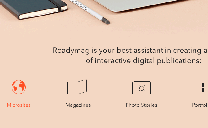
31) Readymag
Mixing two similar sans-serifs is generally considered a bad idea. However, Readymag seem to know what they are doing when they combine Nobel and Avenir. Nobel is almost used as a display version of Avenir by being set only at large sizes. It’s an interesting and unusual approach but I think it works.
![An Oral History of Boogie Nights]()
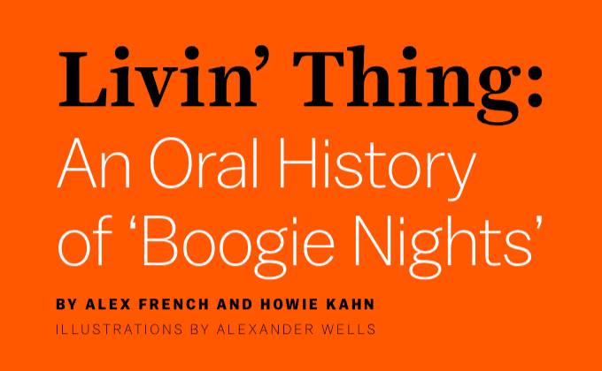
30) An Oral History of Boogie Nights
The “Livin’ Thing” title is set in the text style of Harriet rather than the display style one might expect from a large title like this. However, the display style might be a little too high-contrast when combined with the delicate light weight of Balto which might have been why the designers used the text style instead. This shows that just because a typeface has a display version doesn’t mean it’s always necessary to use it when setting titles.
![Forefathers Group]()
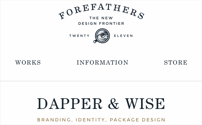
29) Forefathers Group
This site uses a simple and consistent type system. Both Century Schoolbook and Montserrat are set entirely in uppercase, while Fjord One is used for paragraphs. Both Montserrat and Fjord One are open-source fonts available for free on Google Fonts. Fjord One doesn’t contain any italic styles, so it’s not ideal for setting body copy, however, for the small amounts of text here it works fine. It’s nice to see the logo type using a crisp and scalable SVG.
![Future Father]()
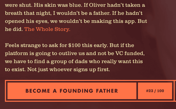
28) Future Father
I’ve always loved the combo of Clarendon and Futura. The warmth of Clarendon just contrasts so nicely with the cold modernism of Futura. The colors on this site perfectly complement the type as well. The logo is set in the beautiful and ornate Bookman Swash.
![un Projects]()
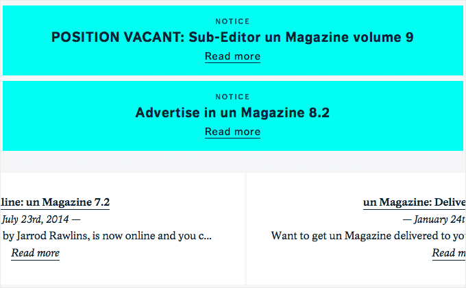
27) un Projects
FF Dagny, a sans-serif from FontFont, works well combined with Academica, a typeface designed for use in scientific papers. I love the use of Academica, but unfortunately the line length of the body text expands to fill the screen size, so on a large display like mine the readability suffers.
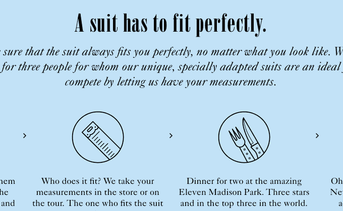
![If the Suit Fits]()
26) If the Suit Fits
This site is another nice example of a brand showing consistency between the type on their physical marketing and their digital marketing. I love the combo of Bodoni Poster and Futura. Caslon is used for the body copy.
![Newswordy]()
25) Newswordy
This is the first time I’ve seen Standard CT used on the web and I really dig it. However, I would have loved to see the entire site set with Standard CT rather than being combined with Helvetica Neue.
![Headspace]()
24) Headspace
Brandon Grotesque really makes a perfect match for this style of quirky, “flat design” illustration. I feel like Brandon Grotesque might be getting a little overused but this site makes excellent use of the typeface. The type effortlessly switches between uppercase and italics to keep things fun, dynamic and engaging.
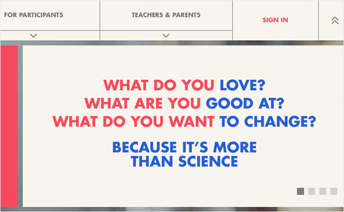
![Google Science Fair 2014]()
23) Google Science Fair 2014
The new website for Google Science Fair 2014 appears to have been art directed by Wes Anderson. I think the designers did a great job pulling off this style. Personally, I find the large photo backgrounds distracting and would have preferred to just see the strong Futura type set against a solid color background instead.
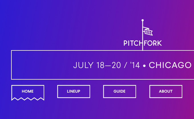
![Pitchfork Music Festival]()
22) Pitchfork Music Festival
Larsseit is one of my favorite recent sans-serif releases and the Pitchfork Music Festival site makes great use of it. Only one typeface is used and that is all that is needed.
![Harewood House]()
21) Harewood House
I immediately fell in love with the type on this site. The light weight of Bodoni Egyptian just plays so nicely with the simple grotesque, Graphik. This is truly a gorgeous site.
![Concrete Matter]()
20) Concrete Matter
It’s nice to see a site using FF Super Grotesk. It has a similar feel to the mega-popular Brandon Grotesque but is used way less on the web. It makes a great combo with the playful rounded serif Rooney.
![Pete Nicholson]()
19) Pete Nicholson
Mixing two different serif typefaces is generally considered a bad practice in setting type. However Pete Nicholson’s site breaks the rules by combining Larish Neue with Lyon Text and I think it looks great. The two serifs are different enough to provide adequate contrast while still feeling like they belong together.
![True Detective]()
18) True Detective by Nigel Evan Dennis
On first glance, Sofia looks a little like Futura, especially with the bold weights. However, on a closer look it has a less-geometric, more playful feel to it. It’s a great match for the illustration style of Nigel Evan Dennis.
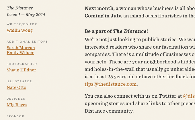
![The Distance]()
17) The Distance
This site feels like you are reading a well-designed newspaper thanks to the ever popular combo of Sentinel + Gotham.
![Co.Exist]()
16) Co.Exist
Grumpy is another seventies-style chunky serif that works great at large sizes, like on the headlines on the Co.Exist site. Caslon accompanies it, which makes sense as Grumpy is based off of the ultra bold styles of Caslon. Museo Sans is used for body copy.
![Sivert Hoyem]()
15) Sivert Hoyem
This is another site with low contrast and muted colors, although when you hover over a section the contrast increases which is great. The font Circular is great for this type of minimal design.
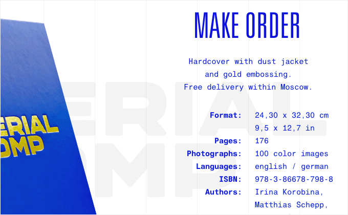
![Imperial Pomp]()
14) Imperial Pomp
I didn’t even know a monospaced version of Helvetica existed until I came across this site. It actually works fairly well as a body copy font in the short amount of text on this site. And I love the use of the ultra-condensed version of Univers for headlines.
![Ableton]()
13) Ableton
I love the use of Futura on Ableton’s new site. Wes Anderson would be proud. The small bits of yellow type on white can be a bit hard on the eyes at times, but the splashes of color used throughout the site really add to the design.
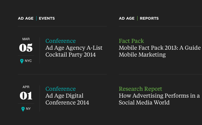
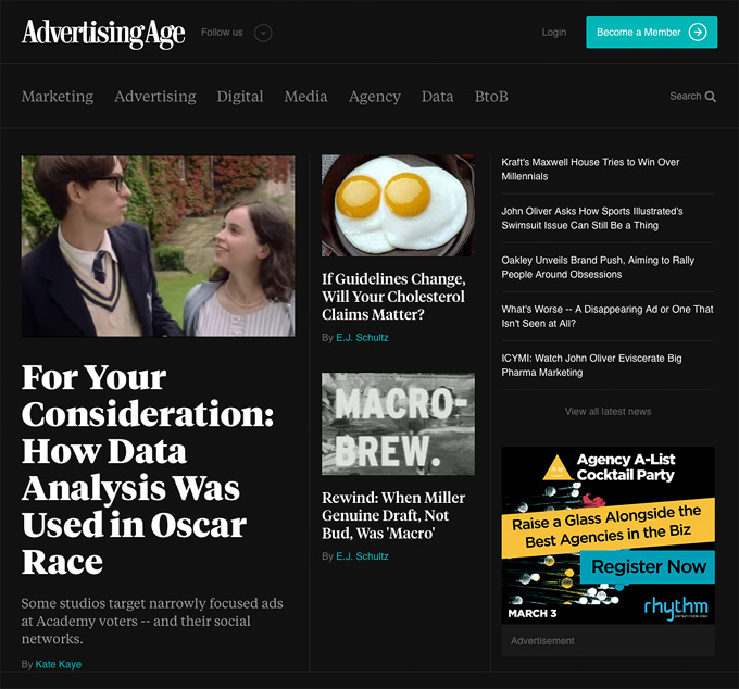
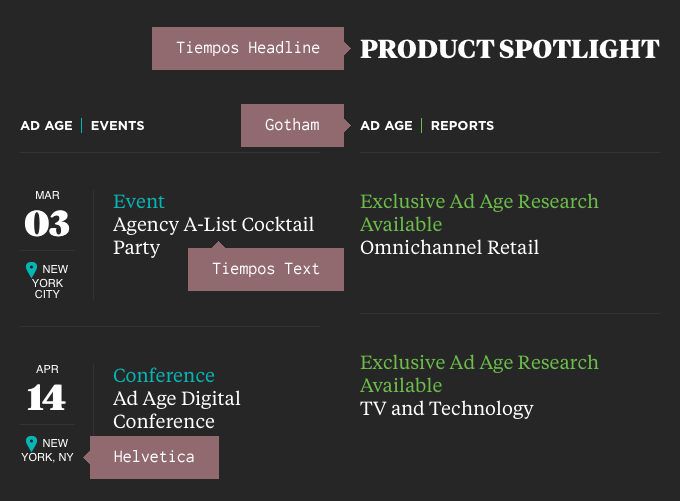
![Advertising Age]()
12) Advertising Age
I first saw Tiempos used on the web on Frank Chimero’s What Screen Want site. It’s a great typeface and looks wonderful on Advertising Age’s new site, designed by one of my all-time favorite agencies, AREA 17. There are small amounts of Gotham mixed in and I would have loved to see Gotham used exclusively as the sans-serif typeface instead of mixing it with Helvetica.
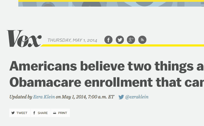
![Vox]()
11) Vox
Mixing two sans-serifs doesn’t always work but Vox seems to pull it off pretty well. They stick to Balto for all their headlines and then use Alright Sans for body copy. The serif Harriet is interspersed throughout as well.
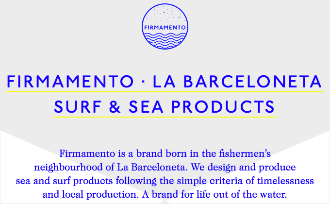
![Firmamento]()
10) Firmamento
ITC Johnston (famous for its use in the London Underground) is set exclusively in caps and looks great paired with Caslon.
![Bloomberg View]()
9) Bloomberg View
This is the first time I’ve seen Supria Sans used on the web and I gotta say I’m very impressed. Supria Sans was designed by Hannes von Döhren, the same designer who created the super-popular Brandon Grotesque. Bloomberg View uses Supria Sans as the sole typeface on their site and they make nice use of the various weights. It’s another great example showing that sometimes one typeface is all you need.
![Bloomberg Politics]()
8) Bloomberg Politics
I love when a big news site pushes the boundaries of web type like this by going all out with web fonts. Neue Haas Grotesk, the original Helvetica, looks wonderful on the chunky headlines. Both the headline and text styles of Tiempos are used beautifully. However, there are still bits of Arial mixed in here and there, most likely left in the design inadvertently.
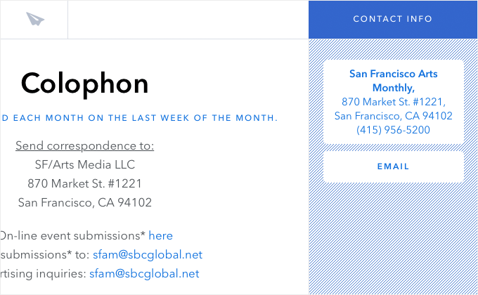
![SF/Arts]()
7) SF/Arts
Avenir is the only typeface used on this site and the designers did a great job of creating a clear hierarchy simply by setting the type in different weights and using different type treatments such as uppercase for subheaders. They also did a superb job of keeping the line length at an optimal width for reading throughout the site. Oftentimes when a site expands to fill the browser window like on this site, the line lengths can expand along with the size of the window, which quickly makes for a poor reading experience on larger displays. This site keeps an optimal length from mobile to large displays like mine.
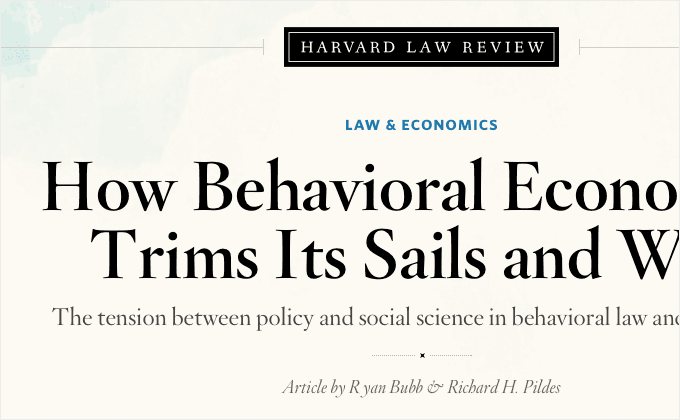
![Harvard Law Review]()
6) Harvard Law Review
The Harvard Law Review site makes excellent use of Hoefler & Co’s Cloud.typography service, using Hoefler Titling paired with Whitney. The type looks gorgeous on this site. However, it would have been great to see them go all out and use Hoefler Text for the body copy rather than Georgia.
![The Monocle Cafe]()
5) The Monocle Café
Plantin is a beautiful typeface that went on to inspire the creation of Times New Roman. It’s a shame that it’s not used on the web very often. The italic is especially beautiful and The Monocle Café feature it prominently throughout their site.
![n+1]()
4) n+1
This entire site uses just one typeface — Adelle Sans. There are no bits of default fonts like Arial and Georgia thrown in which oftentimes happens. Adelle Sans has such a full range of weights that introducing a second typeface into the design is not needed.
![NYT Cooking]()
3) The New York Times Cooking
The New York Times have been using Cheltenham as a headline face for over 100 years, so it’s nice to see it used on the web in their Cooking section. Cheltenham is used sparingly, mostly for headlines and short descriptions, but it really helps to establish the NYT brand. The slab serif Karnak is used for headers and the rest of the type is set in the classic newspaper face Franklin Gothic.
![Not Coming]()
2) Not Coming 2013 In Review
I think using the calligraphic-inspired Ogg with the quirky grotesque Maple is such an interesting and unusual combination. The body copy serif Elena seems to provide a sturdy foundation and works to anchor the other two fonts together.
![OKREAL]()
1) OKREAL
I love when designers set out a clear system for using type and then stick with it throughout the entire site. ITC Clearface is only used at large sizes while the body copy is set with Goudy Old Style. GT Walsheim is used sparingly for the nav and small headers, always set entirely in uppercase.
Keep Up With the Latest in Type for 2015
If you enjoyed this post, then be sure to check back in with Typewolf throughout 2015 whenever you need typography inspiration. You can sign up for the monthly newsletter below, follow @typewolf on Twitter or get blog post updates on Feedly.
Also be sure to check out the most popular fonts from 2014 as well. Thanks for reading and best wishes for 2015.